

Overview
SAP Subscription Visual Configurator
Redesigned SAP CPQ subscription configuration from a fragmented, table-based workflow into a visual timeline experience, enabling faster creation and comparison of complex subscription offers for sales teams.
Role
Sole Product Designer
Skills
Figma
Product Design
Prototyping
Stakeholders
CTO
CPO
Head of UX
Client
SAP CPQ

SAP CPQ (Configure, Price, Quote) is an enterprise platform used by sales teams
to manage complex subscription offers: multi-component bundles, tiered pricing, and long-term contracts.
Problem
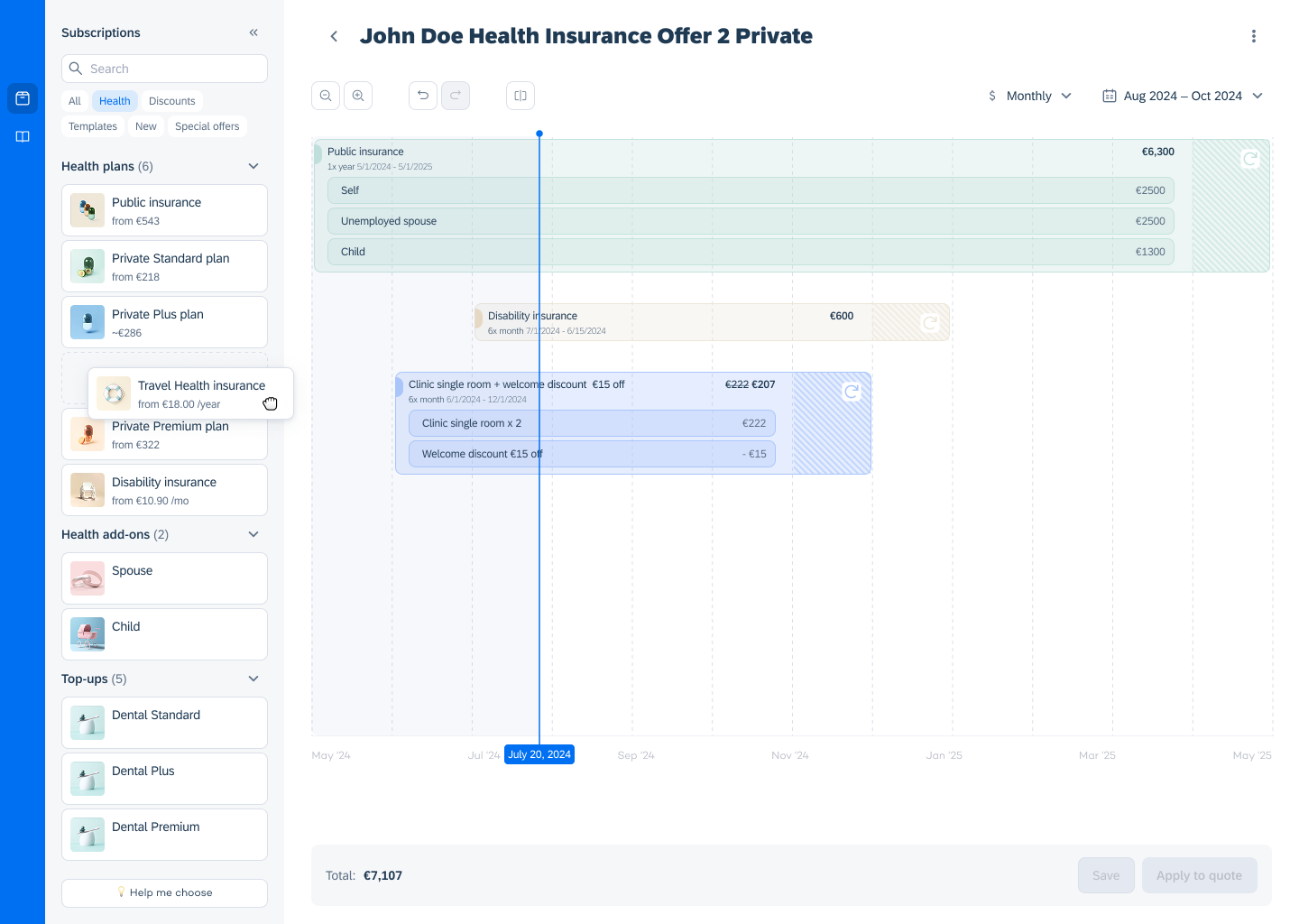
SAP CPQ relies on dense tables and nested modals to configure subscriptions. For sales reps managing complex bundles (like health insurance packages), this means navigating multiple disconnected screens with no visual sense of what a subscription looks like over time.
The result:
✗ high cognitive load
✗ frequent errors
✗ no way to confidently compare offers
Brief
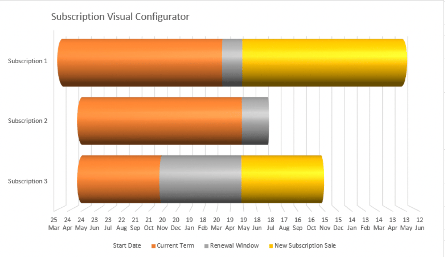
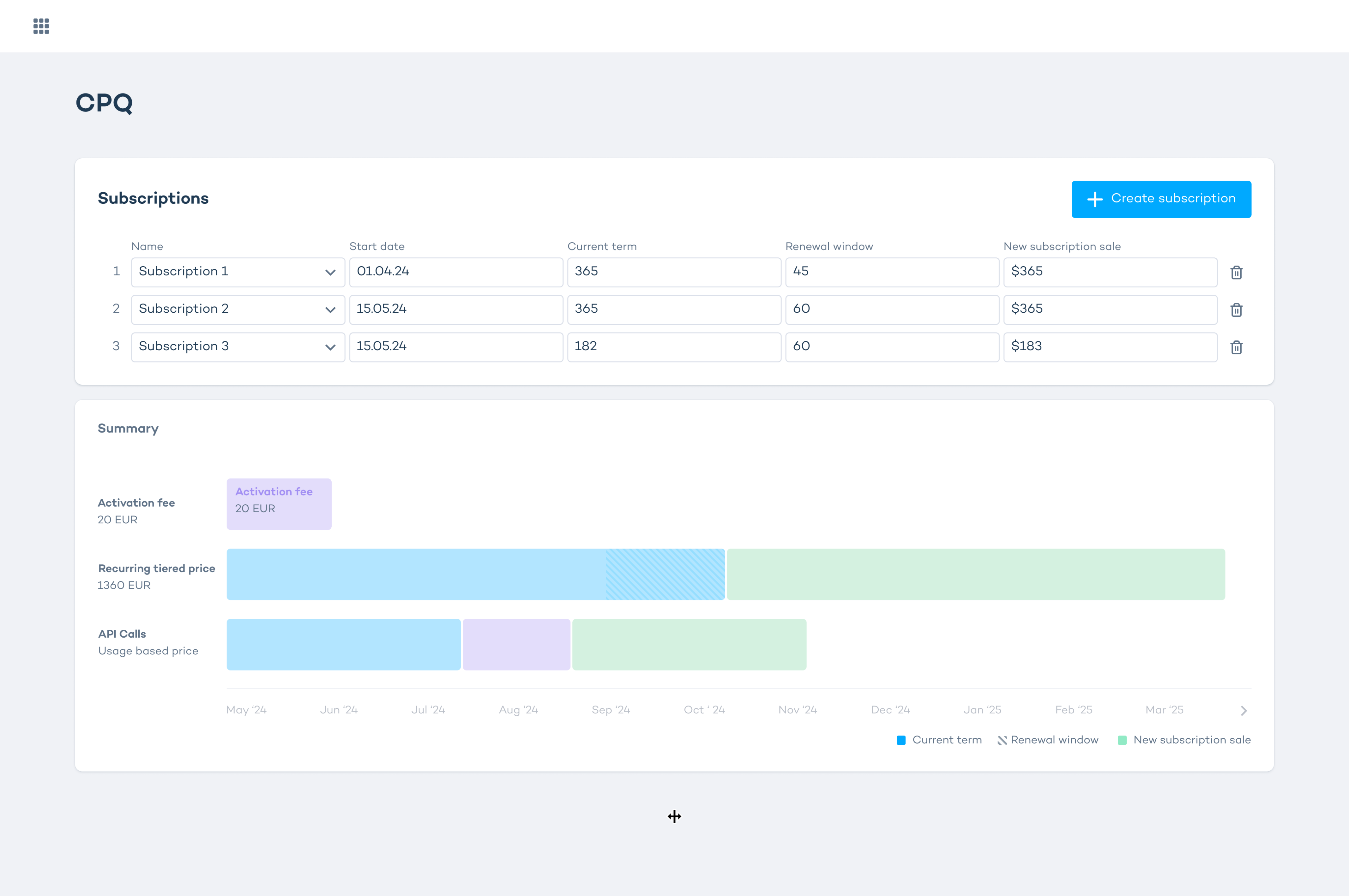
SAP's Head of CPQ came with a rough concept:
a timeline-based "tube" visualization of subscriptions. Strong idea, but only a PowerPoint sketch with no interaction model and no real-world scalability.
My job was to turn it into a viable product.
Exploration
The core UX challenge was balancing visual clarity with access to complex pricing data.
I explored three approaches:
1. Inline fields above the timeline
Detailed plan info visible upfront, but too much information at once, poor scalability as subscriptions grow.
2. Side drawer on click
Timeline stays clean, details appear in a panel. Better information hierarchy, but splits attention between two areas.
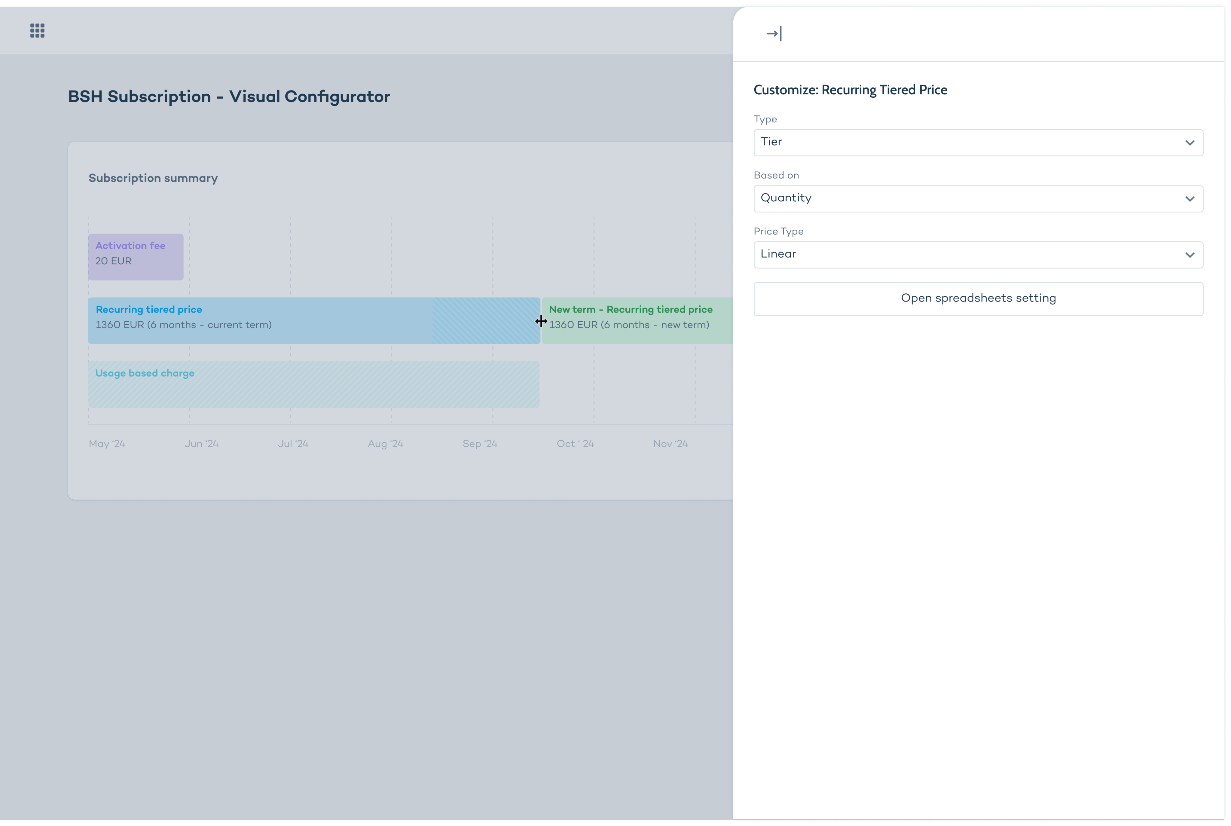
3. Contextual popup on click ✓
Details appear directly over the timeline item, keeping context intact. Most seamless, but required validating that all necessary fields would fit.
Tested and confirmed – this became
the final pattern.
Solution
Three core workflows, designed around real sales scenarios:
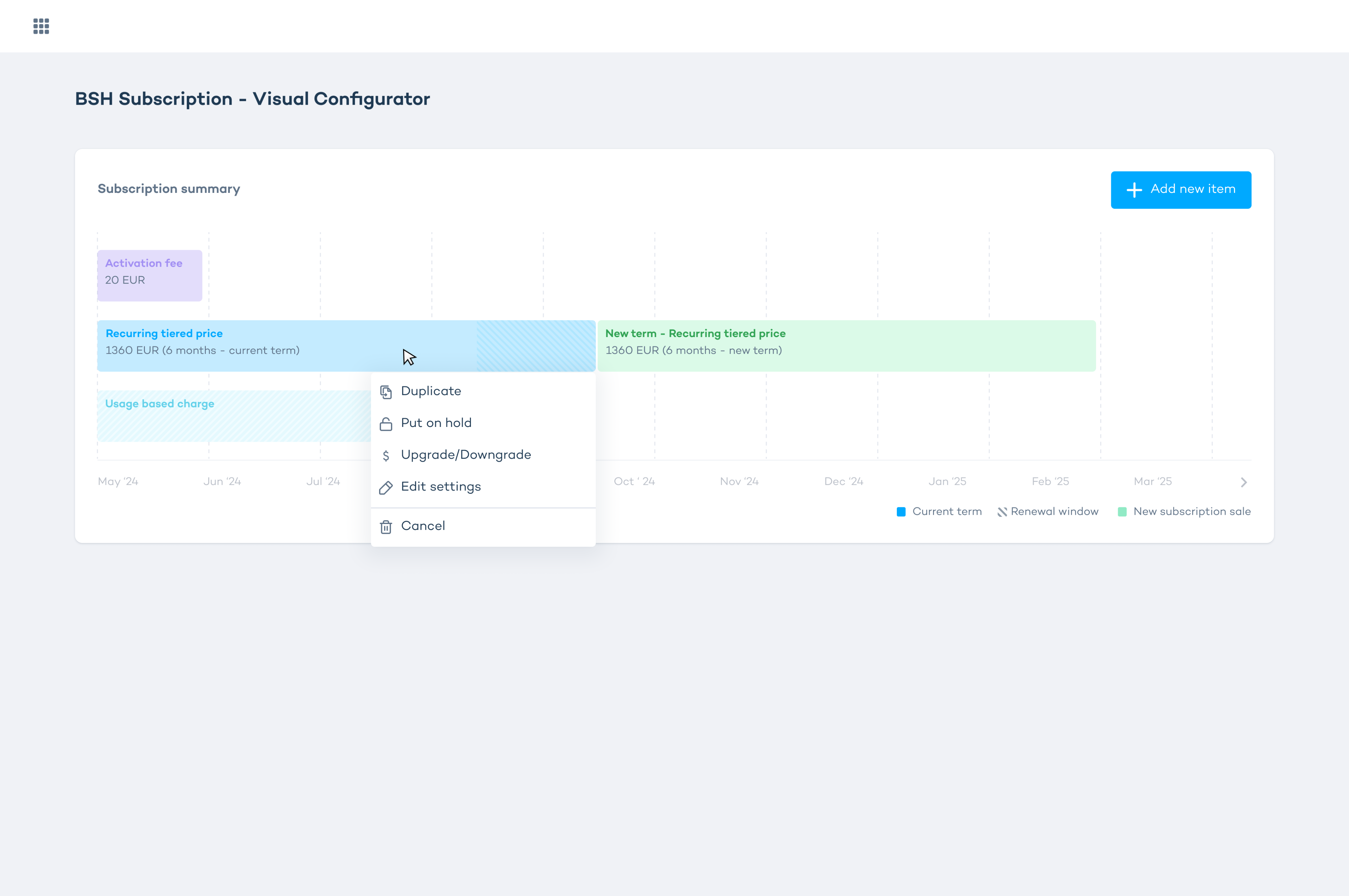
Workflow 1: Create & Compare
Build a subscription offer using drag & drop from the catalog, edit prefilled details inline, then compare it side-by-side with another draft and export to PDF for the client.
Workflow 2: Cotermination & Bundling
Coterminate multiple subscriptions for one client and combine them into a bundle with one payment date and easier management. Pricing and discounts update live as items are dragged.
Workflow 3: Update Existing Subscription
Add new coverage to an existing plan using prebuilt templates, for example adding foreign travel insurance to an active health plan.


